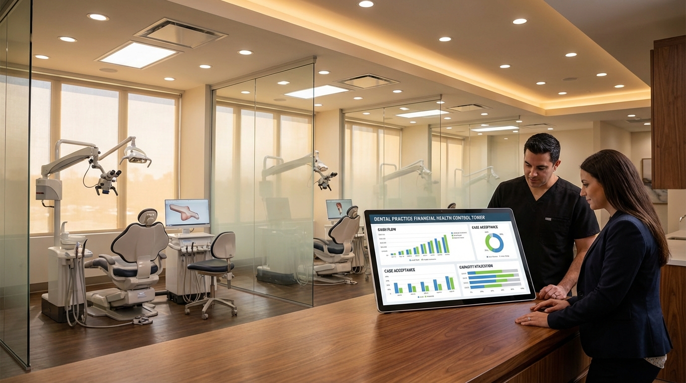
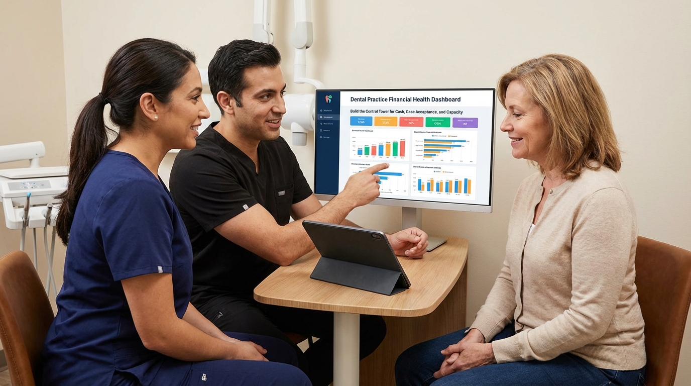
Most owners stare at collections reports that lag by 30 days while cash is leaking from no-shows, overstaffed days, or ads that quietly doubled their CAC. A dental practice financial health dashboard fixes that. It consolidates chair utilization, marketing efficiency, case acceptance, and cash conversion so you can make staffing, ad spend, and pricing calls before the month is gone. We built this control tower for a three-location Atlanta implant group after they swung from +$210K to -$34K cash flow in two quarters. Once every leader had the same live numbers, they trimmed wasted ad spend in 48 hours, rebalanced hygiene chairs, and put $112K back into booked production in four weeks. Here’s the exact blueprint.
Dental Practice Financial Health Dashboard: Build the Control Tower for Cash, Case Acceptance, and Capacity
By KamGeneral1,375 words7 min read
Design the Dental Practice Financial Health Dashboard Around Five Revenue Levers
Anchor every widget to cash, capacity, and conversion
Start by defining the five numbers you must see every morning: booked production, collected cash, case acceptance percentage, chair utilization, and CAC-to-LTV ratio. Everything else is noise. We arrange the dashboard in quadrants: revenue engine (production + collections), demand engine (leads, CAC, show rate), capacity engine (chair hours available vs sold), and margin guardrails (write-offs, financing fees). That layout keeps a $3M practice from obsessing over vanity metrics like impressions when the real problem is unused op time on Wednesdays. Pull historical baselines from the dental practice growth benchmarks playbook so you know what “good” looks like in metro Southeast markets. Then wire goals into each tile. For example, Midtown Dental’s dashboard shows “Case Acceptance 62% vs goal 70%,” “Chair Utilization 78% vs goal 85%,” and “CAC/LTV 0.14 vs ceiling 0.18.” This makes leadership conversations binary: are we above or below the line? Use authoritative data to validate assumptions. The ADA’s 2024 Economic Outlook notes that hygiene production per visit averages $165 and specialty visits exceed $3,800 in urban markets (source). Plugging those figures into your dashboard protects you from lowballing revenue potential when you model new services.
Wire Live Data Sources Into the Dashboard Instead of Static Reports
Automate feeds from PMS, marketing, finance, and CRM
A dashboard is useless if someone exports CSVs once a week. Connect your PMS (Dentrix, Eaglesoft, Open Dental) via API or nightly SQL dump so production, collections, and chair hours update automatically. Layer QuickBooks or Xero for cash, payroll, and financing fees; add Google Ads, Meta, and Local Services feeds for CAC and booked consults; and sync your dental CRM follow-up system for lead stages and speed-to-lead. When we did this for a Birmingham cosmetic office, we caught a silent 19% drop in show rate within 12 hours and redeployed the appointment center script the same day. Use middleware like Airtable, GSheet App Scripts, or Power BI Dataflows to normalize naming so “Full Arch Consult” matches across marketing, CRM, and PMS. Build alerting rules that text the operator when CAC beats the threshold or when AR over 30 days jumps above $85K. Google’s own research shows that companies acting on real-time analytics are 1.6x more likely to grow revenue year over year (source). Dental groups are no different; the practices who see data fastest make cuts fastest. Protect data trust by surfacing metadata next to each tile: last refresh time, data source, and owner. When coordinators can see “Updated 5:12 AM from Open Dental,” they stop arguing with the numbers and start fixing them.

Run Operating Rhythms Off the Dashboard So Actions Happen the Same Week
Daily pulse, weekly war room, monthly board review
Data without cadence dies. We install three rhythms around the dashboard. Daily 10-minute standups check speed-to-lead, same-day collections, and chair utilization. Anything off target triggers a same-day fix (call list, ad shift, overtime swap). Weekly revenue war rooms pull the full dashboard: marketing lead mix, consult volume, acceptance, financing approvals, and unfilled op hours. That’s where the treatment coordinator owns objections and the marketing lead agrees to pause underperforming campaigns. Monthly board reviews zoom out to rolling 90-day trends and new investments. Tie each rhythm to an owner. The AI appointment center lead reports on response time and pending consults using data from the dental appointment setting service dashboard. The case acceptance coach brings clips from the dental implant case acceptance psychology sequence when approval rate dips below 60%. External proof backs the cadence. Bain found that organizations reviewing core KPIs weekly improve EBITDA 20% faster because they catch drift early (source). In dentistry, that translates to cancelling the $8,000/mo billboard the week it stops producing bodies, not three billing cycles later. Document the rhythm inside the dashboard so new team members know why Monday looks the way it does.
Scale the Financial Health Dashboard Across Multi-Location Dental Groups
Standardize inputs, then cascade insights location by location
Once one practice runs smoothly, roll the same dashboard to every location with shared definitions. Create a “Group” tab that stacks key ratios side by side so you can ask why Smyrna’s hygiene utilization is 58% while Buckhead runs at 86%. Layer filters for provider, service line, and acquisition source so you see whether Orlando’s implants struggle because of surgeon availability or because Google Ads blew past CAC. When we deployed this across a six-operatory group in Charlotte, leadership reallocated $12K in monthly ad spend from underperforming pedo campaigns to full-arch funnels and added $74K production within a quarter. Use the dashboard to plan expansion, not just track current clinics. Forecast the impact of adding a third surgery day or an additional treatment coordinator by modeling chair hours, conversion, and cash. Tie every expansion request back to the dental marketing agency playbook so marketing, sales, and ops run in sequence. Cite external benchmarks to keep lenders and investors confident. Becker’s Dental + DSO Review reports that multi-location groups with unified finance dashboards achieve 15% higher same-practice growth than peers relying on spreadsheet rollups (source). Bring that stat to your banker when you explain why you can safely add another $250K in operating line to fund marketing.
Ready to see cash, capacity, and conversion in one screen so you can make $100K decisions in minutes? Book a free strategy call and we’ll build the same financial health dashboard we deploy for high-performing implant and cosmetic groups.
Frequently Asked Questions
What metrics belong on a dental practice financial health dashboard?
Focus on booked production, collected cash, case acceptance, chair utilization, CAC-to-LTV ratio, accounts receivable aging, and financing approvals. Everything else should roll up into those numbers so you stay locked on revenue outcomes.
How often should the dashboard refresh?
Daily at minimum. Mission-critical tiles like speed-to-lead, show rate, and collections should refresh hourly so you can fix issues the same day. Monthly or weekly exports defeat the purpose because you discover problems after the damage is done.
Do smaller single-location practices need this level of detail?
Yes. A $1.5M office is one bad month away from burning cash. Even a lightweight version—PMS data plus marketing and bank feeds—shows you whether the schedule, new patient flow, or collections process is breaking before payroll hits.
What tools can power the dashboard without hiring a developer?
Google Looker Studio, Power BI, Databox, or even Airtable Interfaces work if you connect PMS exports via Zapier/Integromat and marketing platforms via native connectors. The key is standardizing naming conventions so metrics match across systems.
How do you keep the team engaged with the dashboard long term?
Turn the metrics into incentives. Bonus coordinators on rolling 30-day acceptance and days-to-surgery, tie marketing bonuses to CAC and show rate, and review the dashboard in every leadership meeting. When compensation maps to the tiles, the data stops feeling abstract.
Frequently Asked Questions
Ready to Close More Cases?
Book a free strategy call and see how we help dental practices add 40+ new patients in 90 days.
Book Your Free Strategy CallRelated Articles
General6 min read
Asheville Dental Marketing Agency Playbook for High-Value Case Growth
Asheville Dental Marketing Agency Playbook for High-Value Case Growth
General7 min read
Atlanta Dental Marketing Agency Pricing: What It Takes to Buy Consistent Implant Cases
Atlanta Dental Marketing Agency Pricing: What It Takes to Buy Consistent Implant Cases

General6 min read
Back-to-School Revenue Reset for Dental Practices
Reset your practice for the back-to-school rush with scheduling, messaging, and financing systems that turn seasonal slumps into predictable consults.